Admonition toggle arrow should follow similar UI/UX for other projects #48
Description
Context
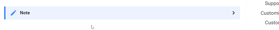
This theme uses an admonition toggle arrow that points "right" when it is "click to open", and "down" when it is "click to close". However, this breaks from convention in a lot of other documentation sites, and I think we should consider just following what those other sites do instead.
For example, a few that I immediately found:
MkDocs: https://squidfunk.github.io/mkdocs-material/reference/admonitions/?h=admonitions#collapsible-blocks
Quarto:

Obsidian:

There are also a few references in stackfoo that talk about this:
Proposal
Our admonition toggle arrow should follow the same pattern of "point right, click to open", and "point down, click to close". This will more likely map onto user expectations, given the other documentation they have likely interacted with on the internet.
Tasks and updates
No response