Update togglebutton style to be more minimal and resemble Jupyter Lab UI/UX #46
Description
Context
Currently, we have a fairly standard "button" UI for the toggle directive:
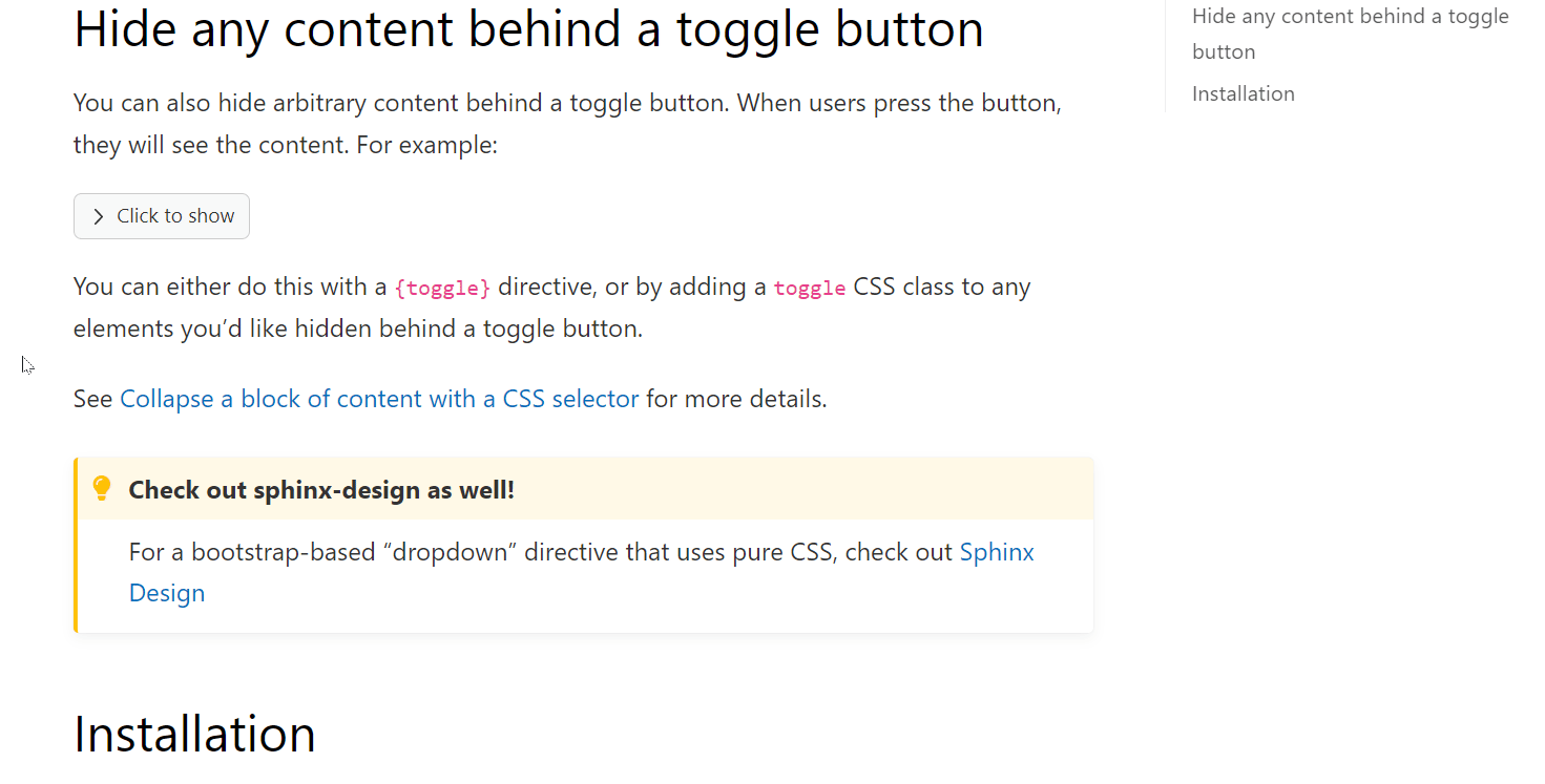
This works fine, though has a fairly "basic" button style.
Proposal
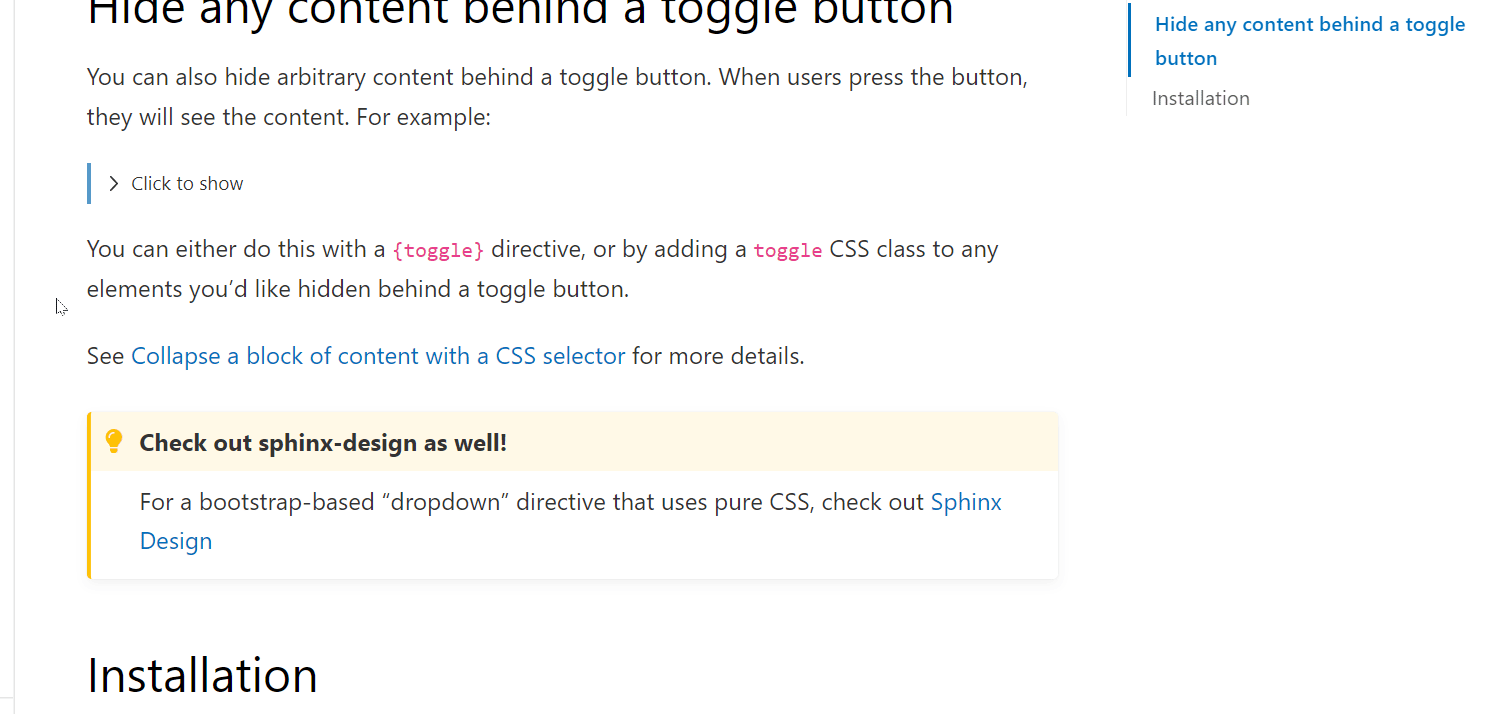
I wanted to see what it might look like for us to re-work this button UI with a few guiding principles:
- Make it more minimal, and reduce the amount of "ink" used in general
- Make it look more similar to the show/hide behavior from Jupyter Notebooks / Lab (since this project is used in conjunction with myst-nb quite often).
I put together this quick prototype with very few CSS changes. Curious if others think this would be an improvement on our current UI:
Alternatively, this might be styling that other themes could implement themselves, if this seems too "opinionated" for a base extension...
Tasks and updates
No response