Improve toggle button design and structure #28
Description
Description / Summary
There are a few ways in which our current togglebutton UI/UX is sub-optimal:
- The buttons are off to the right, which makes them harder to see
- Because they're to the right, they behave weirdly on some screen sizes (see Buttons are cut off on narrow screens #26)
- The admonition toggles use a button to the right as well, which is also hard to see
This is an issue to track some improvements on these patterns. A few ideas that I think were originally proposed by @chrisjsewell in the EB Slack:
-
the
toggleclass for standalone content should behave similarly tosphinx-design, where the element takes up some vertical space in the document flow, rather than being off to the side. This could use a<details><summary>combo and look something like: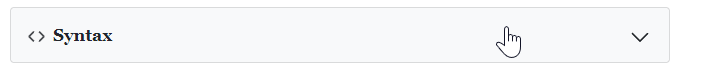
-
the
toggleclass for admonitions should convert the entire "title" area into a clickable field (e.g., with alabel/inputcombination that spans the entire title area of the admonition), so that a user can click the whole admonition title to see a dropdown. See for example this dropdown from Quarto which does this nicely: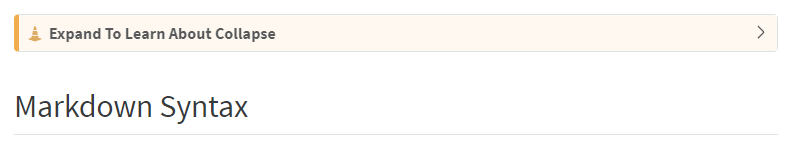
Other inspiration
JupyterLab:

ObservableHQ:

Value / benefit
Improving this would also improve how cell input / output hiding works in Jupyter Book, since we re-use this extension there.
Implementation details
sphinx-design is a good place to look for inspiration about what UI could look like - we should also look at other documenation engines that allow for "click to reveal" behavior, to see if there's some we quite like.
For the admonition-based toggle button, I think it should be relatively easy to achieve a label that spans the whole title field by injecting something like:
<label class="toggle-label" for="toggle-1-input"></label>
<input id="toggle-1-input" style="display; none;"></input>
```css
label.toggle-label {
	width: 100%;
    height: 100%;
    position: absolute;
    left: 0;
    top: 0;
    z-index: 999;
    cursor: pointer;
}
into the admonition p.admonition-title element
Tasks to complete
No response